MN
Mauro Nappolini
Creative Developer
Six
Days
to Ship!
48
96
24
When you have six months, you can explore every option. When you have six days, you trust instinct. The constraint became permission to commit quickly and move forward.
Beautiful animations weren't optional. This is Framer. Motion design is the language. But I chose purposeful over complex: scroll triggers timed to reading rhythm, micro-interactions that feel inevitable. Craft with intention.
The hardest part wasn't technical. It was trust.
How do you establish credibility while documenting a rushed build? By being honest about constraints, transparent about trade-offs, obsessive about details. Remarkable work comes from knowing exactly what you're trying to say, then saying it with conviction.
96
248
Seven Calendar days. Remove Sundays. Six working days. No extensions. No compromises on what matters more than work.
Editorial sophistication became the filter. Not technical complexity. Not feature richness. Editorial sophistication. The kind you see in Kinfolk or Monocle—where space and typography outwork decoration. With six days, I couldn't compete on breadth. I had to compete on point of view.
Typography became the entire visual language:
Satoshi for display
Fraunces for body
Near-black text
One accent color, used sparingly
8px base unit, exponential scale
248
32
248
Thirty-two hours isn't generous. It's barely four full workdays.
48
But it's enough if you know what matters. Enough for a typography system that carries the entire design. Enough for animations that prove craft without theatrics. Enough to ship something remarkable if you're ruthless about cutting everything non-essential. The constraint doesn't limit creativity—it focuses it.
Every hour had to count. Every decision had to eliminate ten other decisions. This is what thirty-two hours of intentional work looks like when you start with strategy, not tactics.
96
48
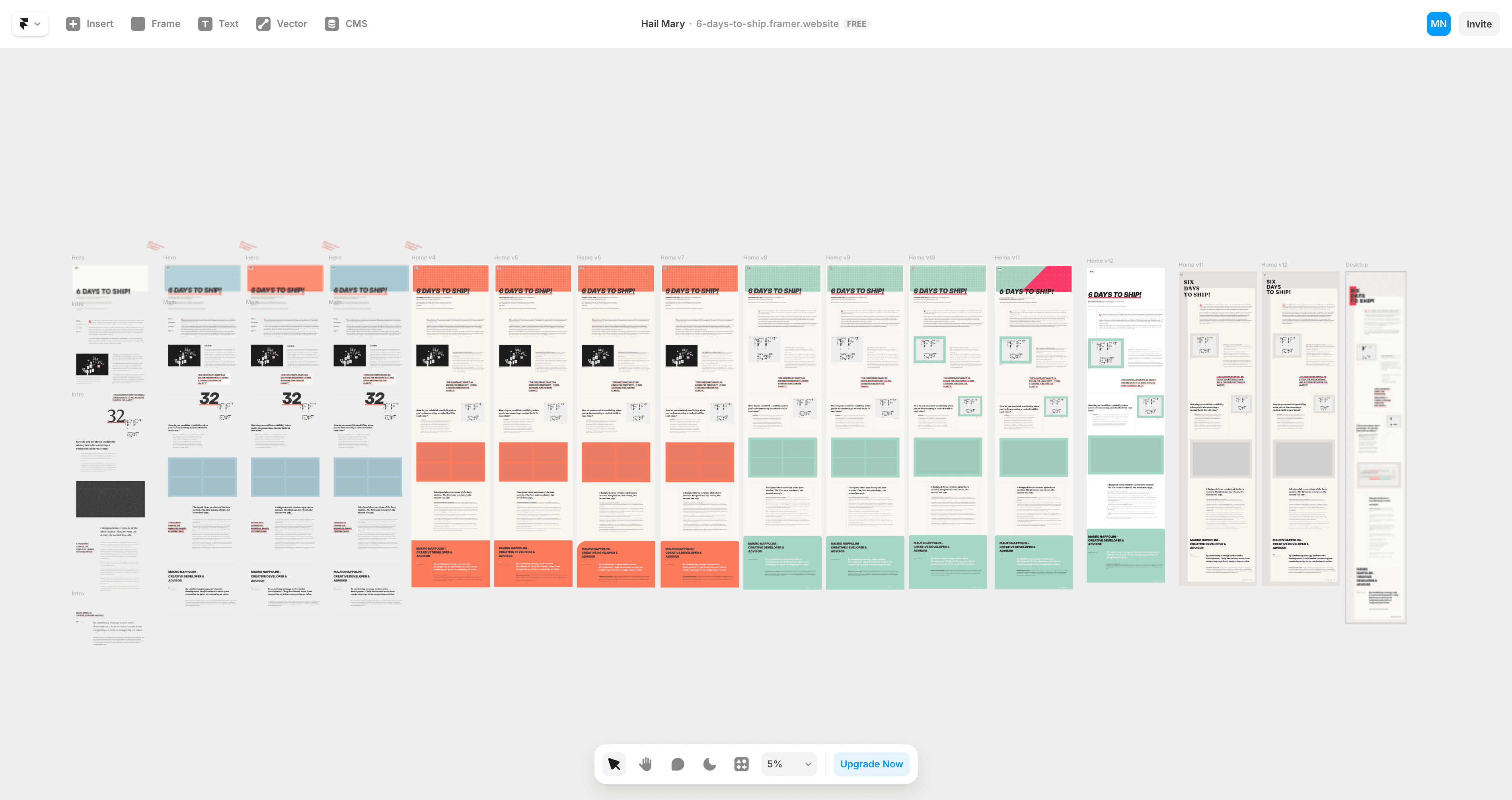
I designed thirteen versions before I was satisfied.
Version Eleven won — Not because it was perfect—because it did one thing perfectly rather than three things adequately.
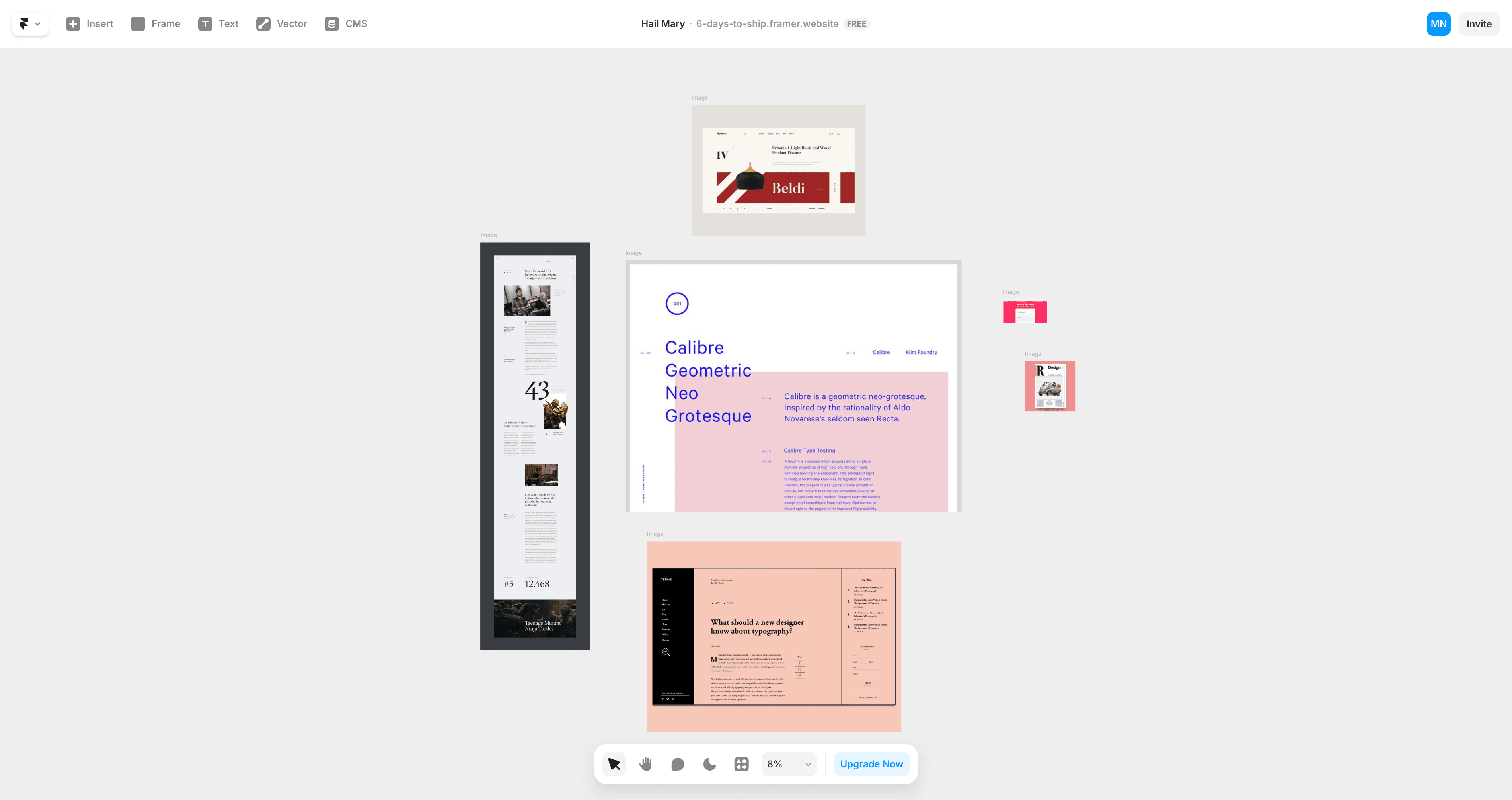
Large display type. Asymmetric alignment. Tension without chaos. Typography would carry the narrative. Images would provide proof.
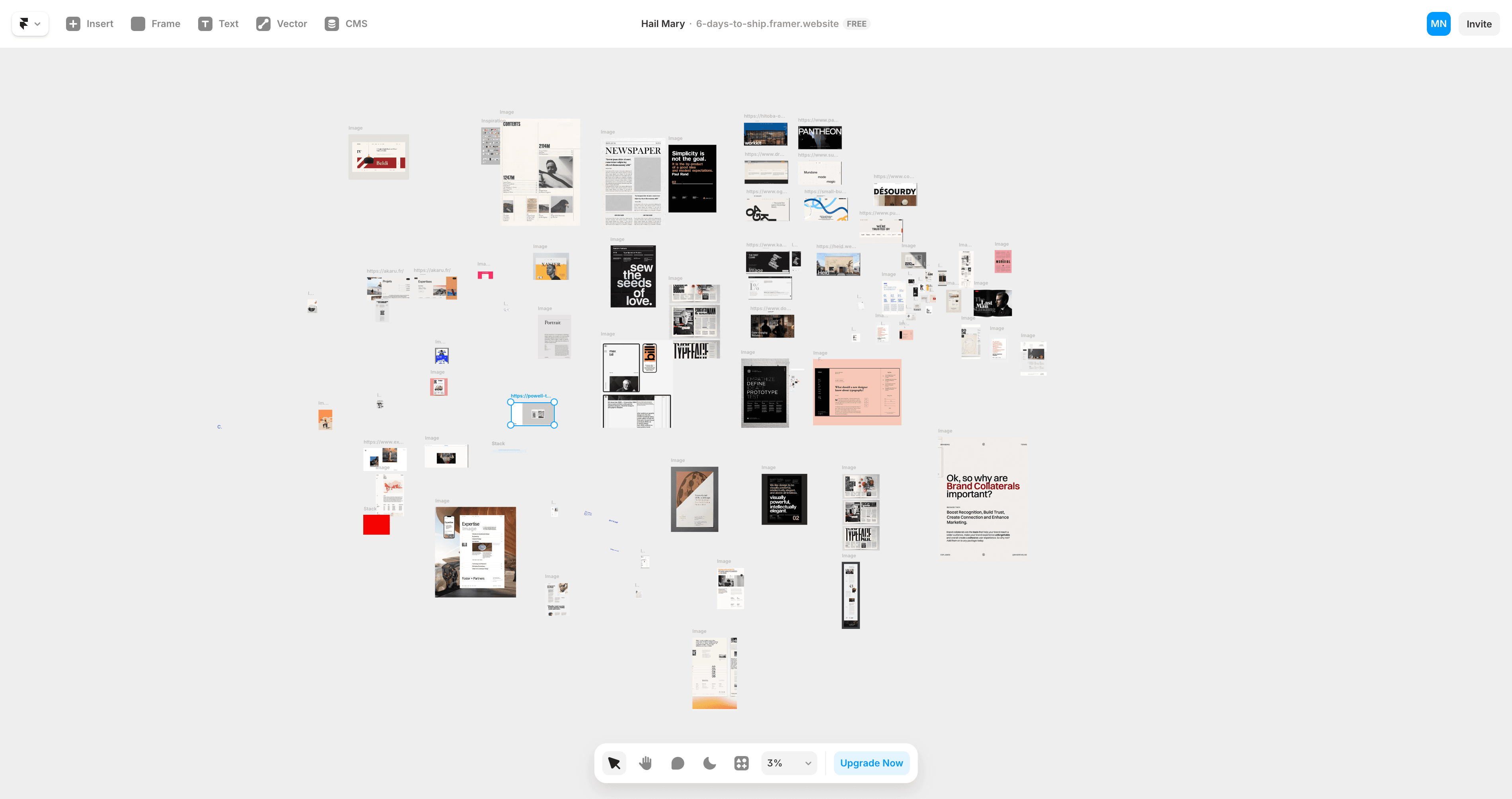
That meant ruthless image selection. Every screenshot teaches something or proves a point.
Failed experiments taught more than successes. I tried dark mode, multiple accent colors, decorative elements—all felt like trying too hard. The typography already had presence.
One long scroll. Like a magazine feature that reveals itself as you read.
Mobile-first meant everything worked at 375px before expanding to desktop. Framer's strength is motion, but I couldn't waste time.
Three animation moments, executed well:
Animated page Load - GSAP
Section text reveal: scroll-triggered - GSAP
Image hover interactions - Framer Native
Hover states: 200ms - Framer Native
Custom Cursor - Framer Native
Restraint everywhere else.
Performance mattered. WebP compression. Lazy loading. Sub-2-second load on 3G.
Day five: functional. Days six and seven: pure refinement.
By combining strategy and creative development, I help businesses move from competing on price to competing on value.
If you're ready to make that shift, let's talk.
Your data is your own!